Case study Docs · SaaS · Teardown to redesign · 2026

One uploader, nine funnels, and the anatomy of a utility sold as a subscription.

A full-funnel UX analysis of ZenDocs based on a live crawl of the production site, which then became the brief: a ground-up redesign of 14 surfaces, from the home and every funnel archetype to the PDF editor, built on one codified design system.

RoleUX / Design Lead, Ruby Labs
Scope40+ tool pages analyzed, 14 surfaces redesigned
MethodLive crawl, internal funnel data, prototypes in code
Viewports1440 desktop, 390 mobile
40+Intent-matched tool landing pages, all feeding one spine
3Page archetypes carrying the entire funnel factory
30+Locales the full funnel set is duplicated across
1Shared email gate sitting inside every funnel's biggest drop

Page and locale counts from the production crawl; funnel and drop-off readings from internal Mixpanel data. Where exact values are confidential, direction and relative magnitude are stated instead.

In 30 seconds
  • Part I, the teardown: three page archetypes power 40+ funnels; the shared email gate is the single highest-leverage surface on the platform; Forms converts best because the landing page is the user's actual document.
  • Part II, the redesign: 14 surfaces rebuilt on one codified system, ending the token drift and giving the AI funnels and post-purchase surfaces the same discipline as the PDF funnels.
  • The proof plan: the email-gate experiment is designed to read cleanly against the existing event map, with guardrails on retention and refunds.
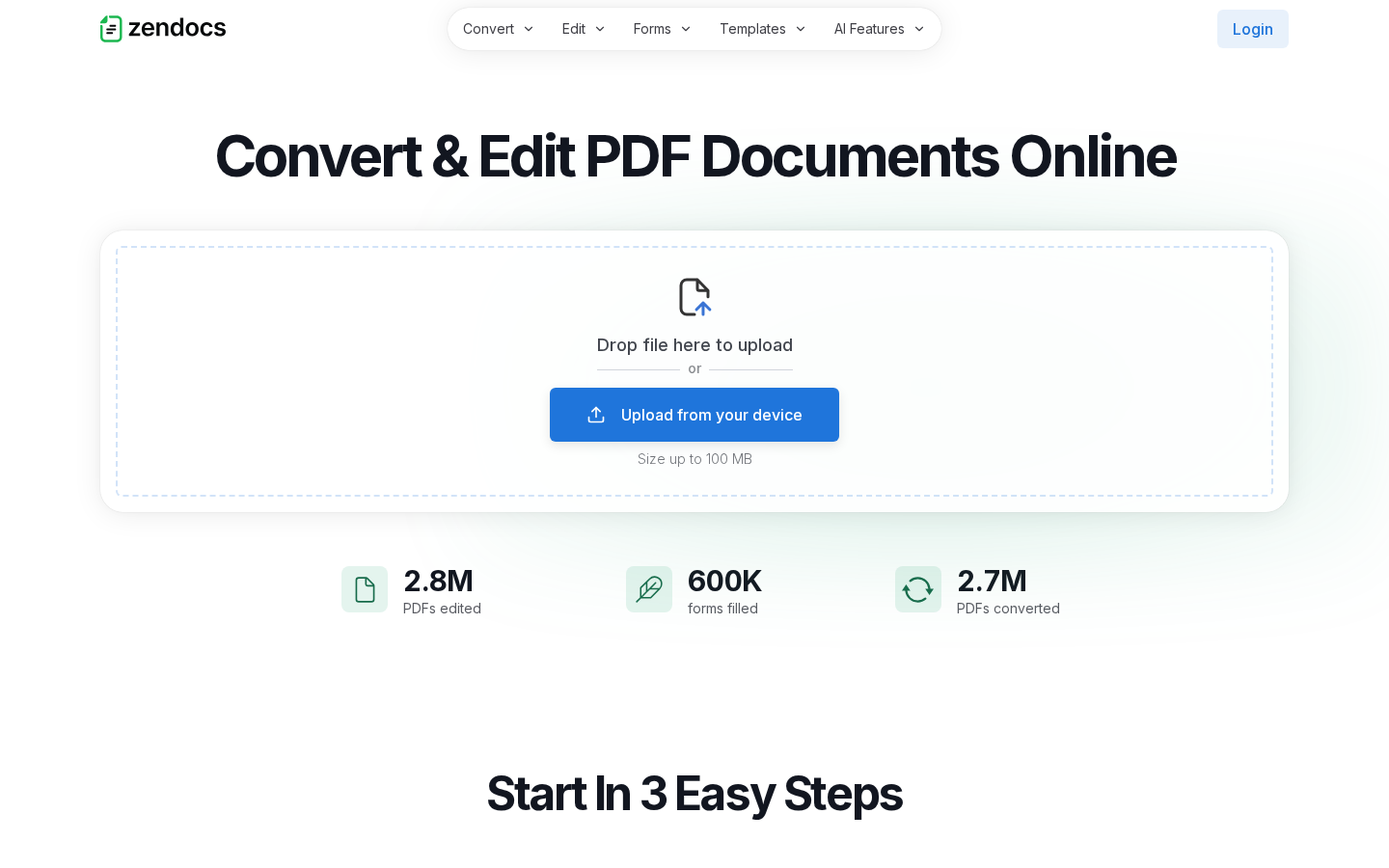
ZenDocs homepage at 1440px with the uploader as hero
FIG. 01 The homepage is archetype A with the brakes off. The uploader is the hero, the mega-nav is the product catalog, usage stats sit directly under the upload zone.
01 · Context and business model

A single-file task, sold as a relationship.

ZenDocs is a browser-based document platform: convert, edit, sign, merge, split, compress, transcribe, humanize. The crawl surfaces the model immediately. Dozens of intent-matched landing pages, one per task and conversion pair, each funneling into the same upload-to-paywall spine, monetized as a trial-to-subscription.

That creates the product's defining tension, and it is visible right on the marketing surface. The homepage FAQ leads with "Is it free to use?" and "How do I cancel my subscription?", and the footer gives How to Cancel its own first-class link. Most users arrive with a single-file task and transactional intent; the business needs them to start a relationship. Every screen between the upload and the download is negotiating that gap.

The scale claims on the homepage (2.8M PDFs edited, 600K forms filled, 2.7M PDFs converted) and the press bar do the trust work that a subscription ask requires from a first-visit utility.

The core UX thesis

Win the task in seconds, then convert the moment of completed value into a trial. The funnel's job is not to sell software. It is to sell the finished file back at the exact moment it exists.

02 · Acquisition architecture

A keyword strategy rendered as information architecture.

The sitemap reads like a keyword strategy rendered as information architecture: a dedicated URL for every convert pair, utility, and editor entry, plus forms, templates, and the AI tools, duplicated across 30+ locales. Underneath the variety, the crawl confirms exactly three page archetypes, and that discipline is what makes the scale maintainable. Archetype A is the tool uploader. Archetype B is the form page, where the document itself is the landing surface. Archetype C is the template wizard behind Agreements.

ZenDocs PDF to Word landing page
FIG. 02 Convert funnel. Same template, intent-matched H1.
ZenDocs sign PDF landing page
FIG. 03 Sign funnel. Identical spine; security language leads where trust stakes are highest.
Strength

One learned layout, forty entry points. A user who lands on any tool page has effectively seen them all. Recognition does the onboarding, and the uploader itself is the CTA, matching the transactional intent of the traffic.

Friction risk

Template sameness cuts both ways. The identical section stack below the fold means tool-specific persuasion is thin: Merge and Compress make the same generic case. For SEO landers that leaves differentiation on the table.

Open question

Toolkit cross-links pre-purchase invite funnel-hopping before the paywall. Does lateral movement raise eventual conversion, or leak intent? A Mixpanel path analysis has to come before touching it.

03 · The conversion spine

Upload, process, ask. In that order, every time.

The spine is identical for every archetype A funnel: upload the file, watch it process, hit the email modal, then the paywall, then checkout, then the result. Mixpanel reads it as mainPageViewed, fileUploaded, emailModalViewed, paywallViewed, purchaseSuccess, dashboardViewed.

Strength

Value before ask. The file is uploaded and processed before any gate appears. The user has sunk effort and the product has visibly done the work, so the ask arrives at maximum leverage.

Friction risk

The email gate is the highest-drop-off surface across all tools, and it stacks back to back with the paywall: two consecutive commitment walls between the user and a file they already watched get processed. Its framing reads as marketing capture when its legitimate job is same-session file delivery.

Open question

Trial framing vs task framing. The paywall sells a platform subscription to someone who came to compress one file. Does task-first framing with the trial as the unlock beat plan-first framing on purchaseSuccess without hurting day 7 to 8 retention?

04 · The users

Not evaluating software. Mid-errand.

Strip away the personas deck and the data describes someone very specific: a person with one urgent document, a lease to sign, a CV to convert, a scan to make searchable. They are not evaluating software. They are mid-errand.

The Task-First Visitor

Behavior

Arrives from a search query that names the exact task, uploads within seconds, and never scrolls below the hero. Recognition of the layout, not persuasion, carries them to the gate.

Friction

Two consecutive commitment walls sit between a finished file and the download. Intent is perishable and every extra ask is negotiating against completed-task impatience.

"The file is clearly done, I can see it on the screen. Why am I filling in a form before I can have it?"

The One-File Owner

Behavior

Buys a trial to finish a single job. Edit and Download dominate their post-purchase actions, and early cancellation intent is high well before the day 7 to 8 renewal.

Friction

There is no natural second job waiting for them. Engagement theater delays cancellation, it does not prevent it, and hiding the exit produces chargebacks instead of retention.

"I got what I came for. I don't need a home for my documents, I need to know you'll stop charging me."

Composite personas synthesized from Mixpanel cohort behavior, support and refund themes, and post-purchase action data. Quotes are illustrative voice, not verbatim.

05 · Forms and Agreements

The best-converting funnel is the one where the page is the document.

Forms is the platform's highest-converting funnel, and the page structure shows why. A visitor searching "W-9 form 2026" lands on a page that is not a tool pitch but the document itself: the form preview, a Get Form CTA, and genuinely useful content about how to fill it. Intent match is near-perfect and the funnel starts at the moment of need.

ZenDocs W-9 form landing page
FIG. 04 Archetype B. The document is the landing page.
ZenDocs agreements template wizard landing page
FIG. 05 Archetype C. The three-step wizard pitch and template search.
Strength

Forms converts because the page is the product. No abstraction between the search query and the surface. This is the pattern the rest of the platform should learn from, not just celebrate.

Friction risk

The Agreement Wizard's constraint is volume, not completion. Completion-to-trial is strong once users enter; the catalog and its acquisition surface are the bottleneck.

Open question

The forms catalog rendered nearly empty in a clean headless session while individual form pages rendered fully. How it behaves on slow connections and for crawlers matters, because it is the hub for the best-converting funnel.

06 · The AI funnels

The second act, still finding its archetype.

Transcribe and Humanizer break the archetype A template, and deliberately. Both pages demo the product on the page, explain the technology, and teach the domain: Transcribe leads with a live demonstration and concrete capability claims; the Humanizer makes the tool itself the hero, with a visible 20,000-character limit and a responsible content block explaining why AI detectors are unreliable on short texts.

ZenDocs transcribe audio landing page
FIG. 06 Transcribe hero. Distinct layout, demo-forward, capability-led.
Strength

Try-before-gate is the right instinct for AI tools. On-page input and a live demo let value be experienced pre-commitment, exactly where skepticism about output quality is the purchase blocker. The responsible-use content is a trust asset in a category full of overclaiming.

Friction risk

Funnel consistency is still settling. The two landers evolved separately from the PDF archetype and from each other; input patterns, section order, and post-upload flows need the same systemization the PDF funnels already have.

Open question

Humanizer has no acquisition traffic yet. Which mix does it launch with, and should its on-page-tool pattern become the template for future AI funnels before traffic scales?

07 · Trust, compliance, and the 390px test

Cancellation transparency as conversion infrastructure.

For a trial-to-subscription utility, churn-adjacent trust surfaces are not decoration. Every footer carries How to Cancel as a named link, every tool page answers cancellation and refunds in plain language before anyone asks, and the uploader states its 100 MB limit up front. Subscription products in this category live or die on chargeback rates, so real cancellation paths and press logos backed by confirming articles protect the funnel they monetize: transparency converts anxiety into information at the exact moment of hesitation.

The model also survives the squeeze to 390 pixels. The uploader stays the first interactive element, the CTA copy adapts to the input modality, and the spine keeps the same order, gates, and events on every device, so funnel analytics stay comparable across viewports. The cost is that two stacked full-screen modals are more punishing on a phone; a per-viewport funnel cut is the obvious next Mixpanel read.

08 · System-level reading

Four principles the platform already proves.

Archetypes as leverage

Three page archetypes power forty-plus funnels in thirty-plus locales. Every improvement to archetype A ships to dozens of surfaces at once; the design system and the funnel architecture are the same investment.

Intent match first

The URL answers the query before the page loads. Forms proves the ceiling: the closer the landing surface is to the user's actual document, the better everything downstream performs.

Value-first sequencing

Process first, ask second. The whole monetization model depends on the ask arriving after visible work, which is why the email gate's framing matters far beyond its pixels.

Trust as retention

Visible cancellation paths, plain-language refund answers, no fabricated proof. The compliance posture is a retention strategy wearing a legal hat.

09 · Where the design gets tested next

The roadmap, ranked by leverage.

01

The gate is the lever

One shared modal sits inside every funnel's highest-drop-off step. The unified email-gate component is specced and data-backed; shipping it behind a clean experiment is the single highest-leverage UX change available on the platform today.

02

Post-purchase must catch up to pre-purchase

The funnels are industrialized, the after is not. Most users own one file and early cancellation intent is high. The dashboard is where trial-to-paid gets won, because day 7 to 8 is decided by whether the product earned a second task.

03

The AI seam needs a system

Transcribe and Humanizer are the growth thesis and the least-systemized surfaces. Locking a shared AI-funnel archetype now prevents every future AI tool from becoming a bespoke rebuild.

04

Editor risk is funnel risk

Edit and Convert ride on the editor, and the in-flight rebuild replacing the licensed dependency is an engineering project whose failure mode is a UX one. Any regression lands directly in two core funnels.

05

Token drift undermines the system

Production surfaces still run migration-era values; the off-token primary blue was the highest-severity finding of the dashboard visual audit. A design system only pays back its maintenance cost when the surfaces converge on it.

ZenDocs post-purchase dashboard with document list and tool entry points
FIG. 07 The post-purchase dashboard: the surface where a one-file visitor either becomes a subscriber or a cancellation.
Part II · The redesign

An analysis that stops at findings is a report. This one became the brief: 14 surfaces rebuilt on one system, with the style guide as the contract.

10 · From teardown to redesign

The findings, converted into scope.

I redesigned the platform's public surface end to end: the home, the tool funnel archetype, the W-4, W-9 and I-9 form landings, both directories, the template landing, the AI tools hub and the Humanizer, the help center and its articles, and the PDF editor itself. Fourteen surfaces, built as interactive HTML prototypes in code with AI-assisted tooling, in days rather than weeks, with working navigation, search, and states instead of static mocks.

Alongside the screens ships a condensed UI style guide covering foundations, component specs, page-level patterns, and interaction rules. The system exists so the next forty funnels don't have to be designed, only assembled, and it feeds the same design-system-as-AI-skill infrastructure used across the org.

14Surfaces redesigned as interactive prototypes
1Codified style guide: foundations to interaction rules
3Archetypes kept and sharpened, not replaced
1 blueTokenized primary, ending the token drift
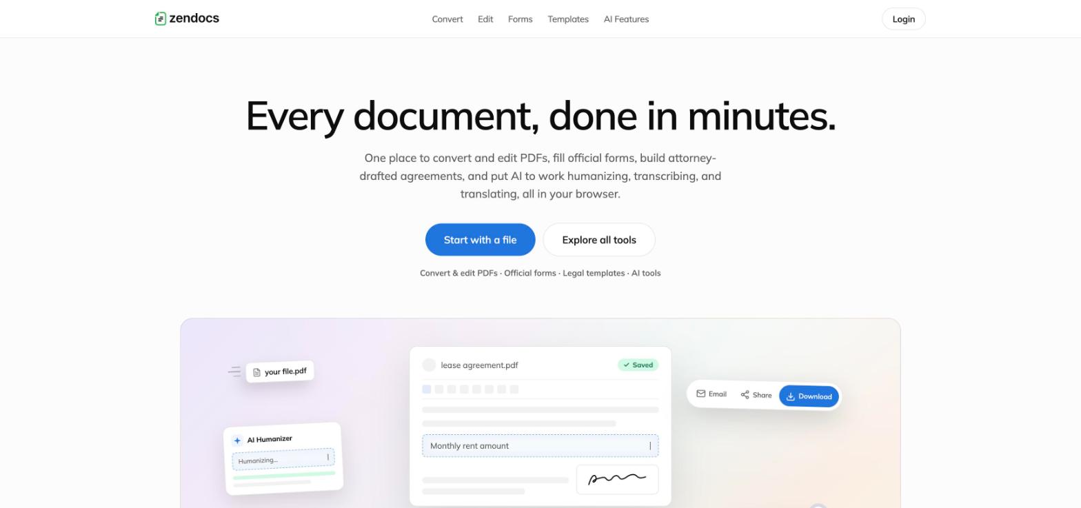
Redesigned ZenDocs homepage: Every document, done in minutes, with a primary CTA pair and product visual
FIG. 08 The redesigned home. One promise, one primary action pair, and the product doing the persuading.
11 · One system: language, patterns, rules

Calm surface, strict system.

Mulish everywhere, a near-white canvas with a disciplined ink scale, hairline borders carrying the structure, and one tokenized primary blue, directly answering the highest-severity finding of the Part I audit. The patterns are law, not habit: the uploader is one spec (the same 372px surface, the same dashed hover target, the same stated limit on every funnel), the tool page order is fixed with Start In 3 Easy Steps always second, and every overlay closes on outside click and Escape.

01

Type does the hierarchy

48px/600 heroes, 40px/500 section heads that are deliberately light, sentence case throughout. The scale carries the page so color doesn't have to.

02

Borders before shadows

Default elevation is none. Cards are hairline-bordered and earn a 1px shadow on hover; the house shadow belongs to dropdowns, modals and floating paper. Depth means something again.

03

One glass recipe

A single frosted formula for nav panels, mobile sheets, modal backdrops and the editor's floating controls. A signature effect stays signature only if it's scarce.

04

Copy tone as a token

Plain, benefit-led, sentence case, no exclamation marks, concrete numbers. Voice is specced next to color so it can't drift either.

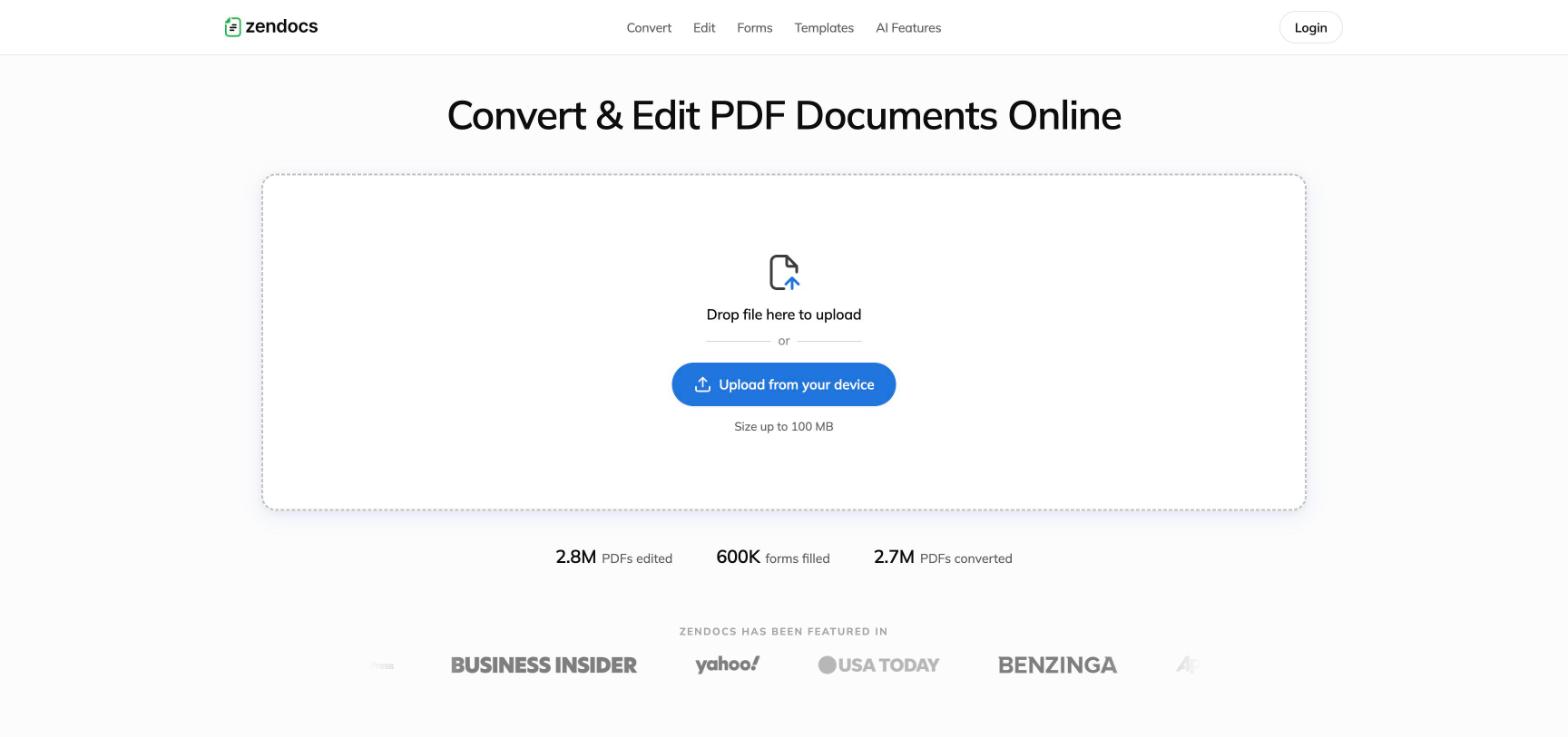
Redesigned Convert and Edit funnel: uploader as hero with usage stats and press marquee
FIG. 09 The funnel archetype. Uploader as hero, stated 100 MB limit, stats and press doing the trust work below.
12 · Redesigned surfaces

Every archetype, rebuilt on the system.

Home: the archetype map as a page

One platform for the whole document: Convert, Edit and Sign, Official Forms, Legal Templates category cards
FIG. 10 "One platform for the whole document." The four product pillars as pastel-tiled cards; the IA of the whole site legible in one viewport.

Form landings and directories: the document stays the hero

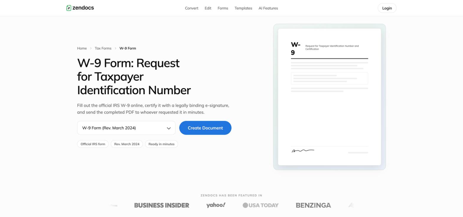
Redesigned W-9 form landing with version selector, Create Document CTA and document mock
FIG. 11 The W-9 landing. Version selector and Create Document in one row, the form itself as the visual. Rail CTAs no longer self-link; they route into the form funnel, matching the hero.
Legal Forms and Documents directory: live search over 121 forms with three category jump cards
FIG. 12 The directory pattern: 121 forms behind one live search with result counts, plus jump cards for browsers. The same TOC-rail component serves forms and templates.

The AI funnel, systemized

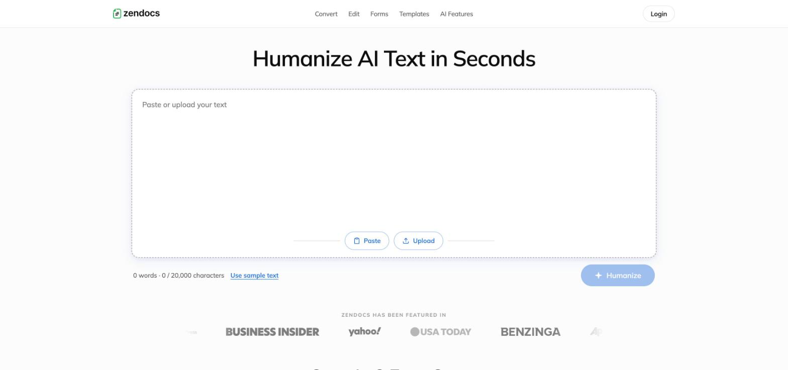
Redesigned AI Humanizer: paste-or-upload input as the hero with visible character limit
FIG. 13 The Humanizer. The tool is the hero: paste or upload, a visible 20,000-character limit, sample text for zero-effort trial, and the CTA disabled until there's input. This is now the template for every future AI funnel.

Post-purchase and the trial band

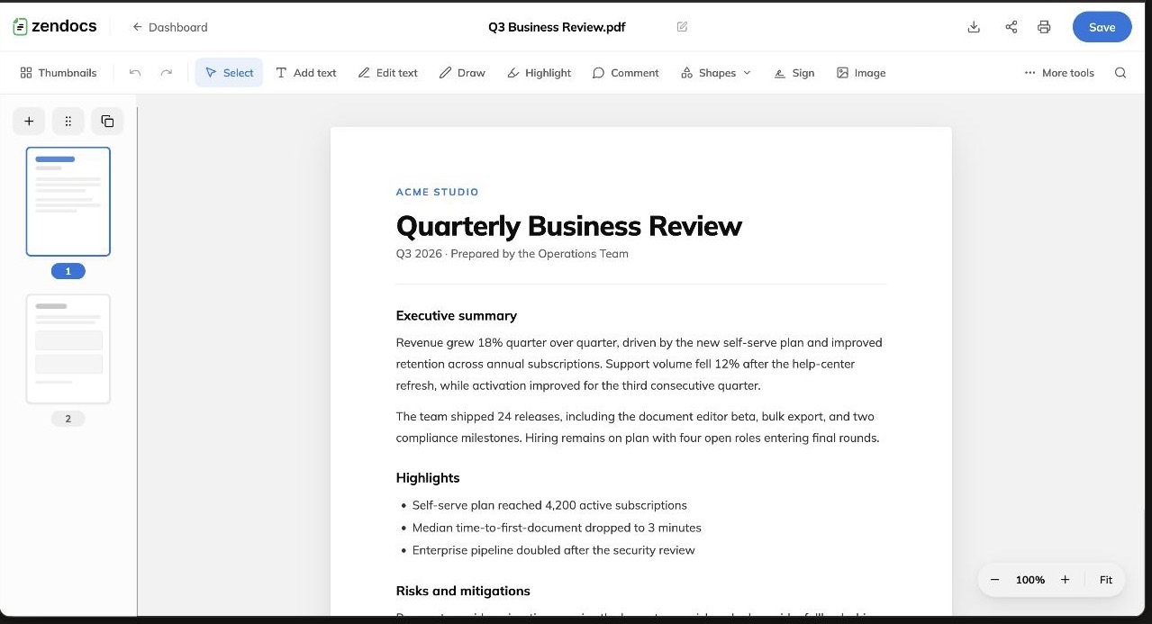
Redesigned PDF editor: top chrome with save, tool ribbon, thumbnail rail and document canvas
FIG. 14 The PDF editor. 60px chrome, 52px tool ribbon, thumbnail rail, floating glass zoom pill. On mobile the ribbon docks to the bottom with 44px targets.
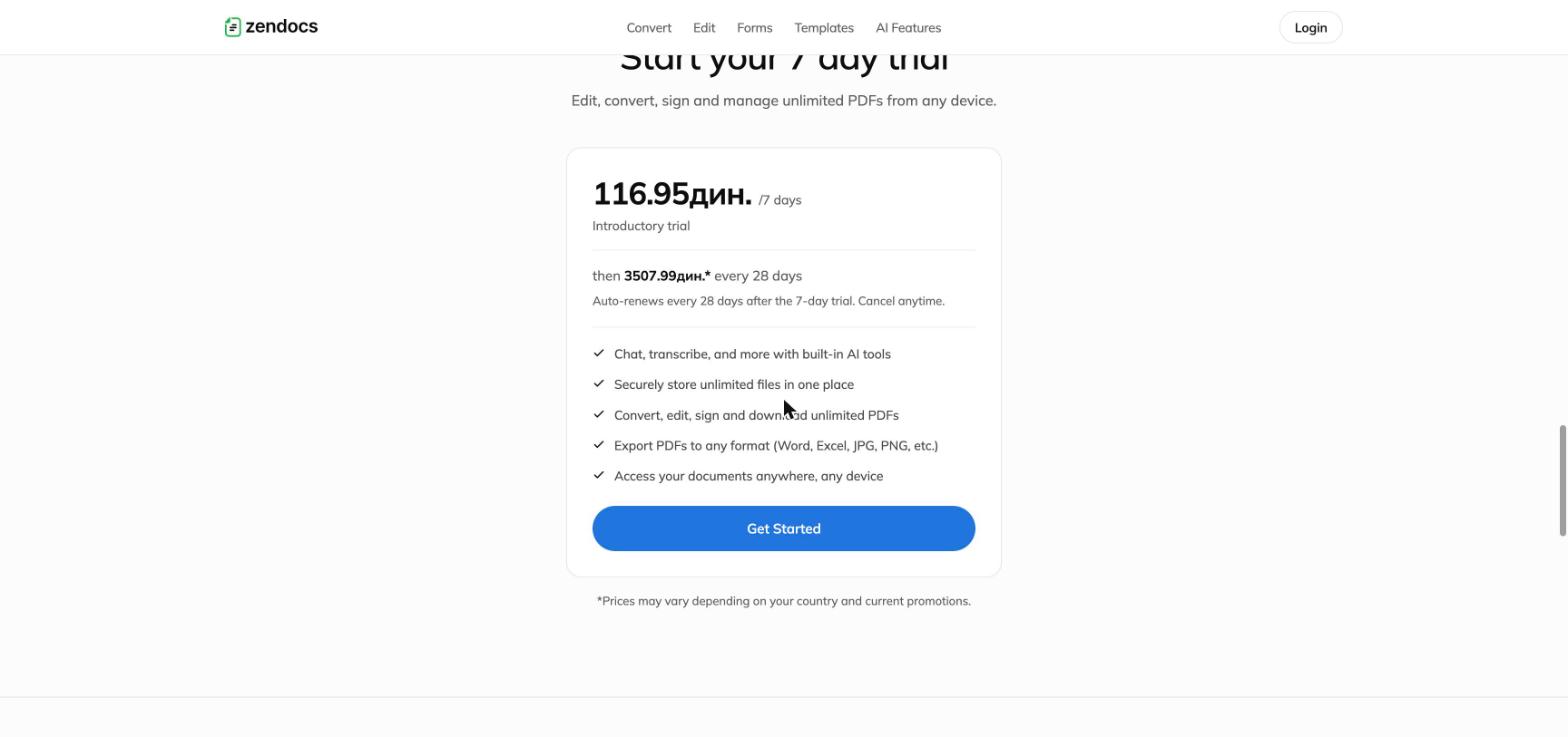
Trial pricing card showing localized introductory price, renewal amount and cadence, and cancel anytime
FIG. 15 The trial card states the renewal price, the 28-day cadence, and cancel-anytime in the same breath as the offer (shown with localized pricing). Part I argued trust is conversion infrastructure; this is that argument as UI.
13 · The proof plan

How we'll know it worked.

A redesign without a measurement plan is a preference. The rollout is designed to read cleanly against the event map that already exists.

01

The gate experiment ships first

The unified email gate goes out as a controlled A/B on a subset of funnels, powered on emailModalViewed to paywallViewed progression. The structural change must not invalidate paywallViewed as the experiment denominator, so the modal is replaced in place rather than resequenced in v1.

02

Guardrails, not just goals

Primary metric is gate-to-paywall progression; guardrails are purchaseSuccess, day 7 to 8 retention, refund rate, and support contact rate. A gate that converts better but refunds worse is a loss, and the readout treats it as one.

03

The system reads per-archetype

Because every funnel is an instance of an archetype, results roll up by archetype, not by page. One clean read on archetype A validates the pattern for forty surfaces at once, which is the entire economic argument for the system.

14 · Findings to patterns

Every Part I finding maps to a shipped pattern.

Token drift

One tokenized primary blue with defined hover, soft-fill and focus-ring derivatives. The highest-severity audit finding is now structurally hard to reintroduce.

Template sameness

The section stack stays shared, but the H1, security copy, and FAQ content are intent-specific per funnel. Differentiation where users read, uniformity where they act.

The AI seam

Input hero, try-before-gate, education block, unified section order. Transcribe and Humanizer stop being bespoke and become instances of one AI-funnel archetype.

Trust surfaces

Renewal terms and cancellation live inside the pricing card, disclaimer bands sit on legal surfaces, the uploader states its limits. Compliance posture became reusable UI.

Post-purchase

The editor and help center now run on the same system as the funnels. The surfaces that decide day 7 to 8 retention are no longer the least designed ones.

15 · Retrospective

What this project confirmed.

The funnel factory is the asset, so every one-off surface is a tax on all future iteration. The email gate is where user effort, product value, and drop-off peak simultaneously, and nothing else on the roadmap touches every funnel at once. Forms should teach the platform, because the best-converting funnel is the one where the landing page is the user's actual document.

And one thing the redesign proved. The findings that mattered weren't the ones that criticized, they were the ones that specced. Every friction risk in Part I maps to a shipped pattern in Part II, and the style guide is the contract that keeps them fixed. Analysis earns its keep when it compiles.

Method, Part I: live crawl of zendocs.com, sitemap extraction from production HTML, structured parsing of 13 pages, rendered screenshots at 1440px and 390px. In-flow surfaces sit behind real uploads and auth, so those readings draw on internal product context. Part II: 14 interactive HTML prototypes plus a condensed UI style guide covering foundations, components, page patterns, and interaction rules.

Next case study

ELIAS 4: a middleware composers can actually use