Case study Metrics generalized Edtech · B2B SaaS

Make a course catalog feel like a path.

A learning platform redesign that replaced a one-size-fits-all content dump with structured learning paths for both employees and customers.

RoleSenior Product Designer
CompanyLearnUpon
TimelineNov 2023 to Mar 2024
UsersInternal employees & enterprise customers
2 daysFaster onboarding time-to-competency
↑ completionEnd-to-end course completion materially up
1 frameworkThree cohorts served by one IA
WCAG AAAccessibility baseline verified in design QA

Onboarding and completion measured against pre-redesign cohorts; exact figures generalized under NDA. Accessibility checked against WCAG AA success criteria during design QA.

In 30 seconds
  • The shift: from "here is all the content" to "here is your path," with milestone-based paths mapped to role and goal.
  • The fix that mattered: weighted milestone progress replaced a technically accurate bar that testers refused to trust.
  • Results: onboarding roughly two days faster and completion materially up; fully self-directed browsing is still the unsolved tail.
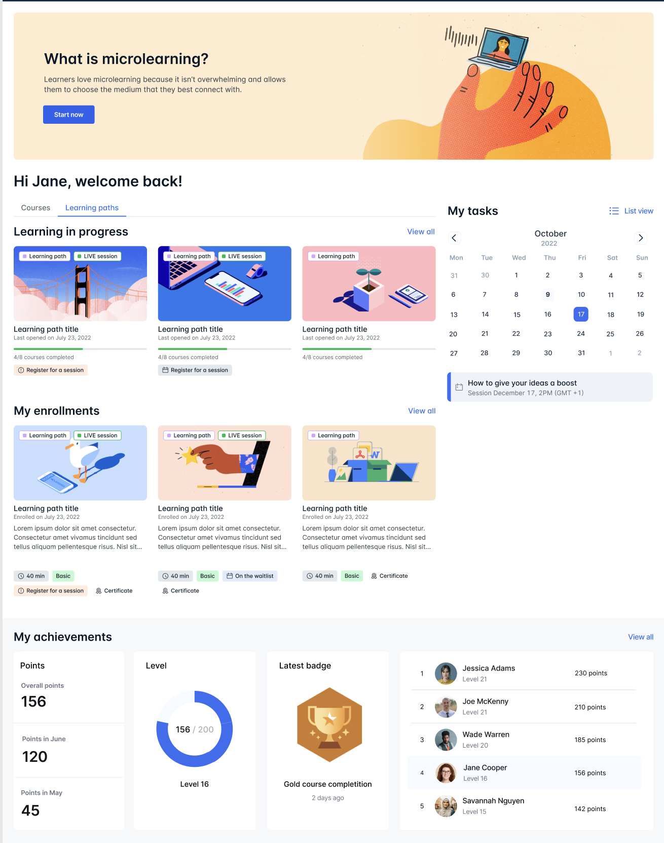
Learning platform overview: path-first home surface with milestone progress
FIG. 01 The path-first home surface. Named paths tied to role and goal replace the search-driven catalog as the primary entry point.
Context

The worst of the catalog and the worst of the LMS, in one product.

Enterprise learning platforms tend to collapse into one of two shapes: a Netflix-style catalog that overwhelms or a rigid LMS that infantilizes. The existing platform had landed in the worst of both: a long list of unranked content presented identically to a brand-new hire, an experienced engineer upskilling, and a paying customer trying to self-serve.

Completion rates were poor, support tickets were high, and "training" was something users actively avoided. The business needed a platform that respected the user's time without dumbing down the material.

Problem & discovery

Three cohorts shared one product. Two drove the failure.

Three cohorts shared one product, but two of them drove the structural failure most clearly.

The New Hire

Behavior

Needs a clear, structured path. Wants to know what to do today, what's next, and when they'll be "done enough" to be productive.

Friction

Faced a flat catalog of 200+ lessons with no priority order. Spent more time deciding what to learn than learning.

"Just tell me what I have to finish this week. I don't need to browse."

The Customer / Upskiller

Behavior

Already competent. Hits the platform with a specific question or a specific gap. Wants to skip what they know and go deep where they don't.

Friction

The platform treated them like a beginner. No way to test out of basics, no signal about what was advanced vs introductory.

"I don't need lesson one. I need lesson seven. Why is there no way to just go there?"

Cohorts and quotes drawn from moderated tests with new hires and customer upskillers during discovery; quotes lightly edited for length.

Core architectural challenges

Three problems that had to be solved structurally.

01

One IA, three cohorts

The same navigation had to feel like a guided onboarding for new hires and a self-serve library for experienced users, without building two products.

02

The drop-off cliff

Most users abandoned somewhere between lesson 3 and 5. The structural cause wasn't content, it was the absence of any visible progress horizon. "How close am I to done?" had no answer.

03

Completion psychology at scale

Progress tracking is easy to implement and easy to get wrong. Show too little and users disengage; show too much and you reduce the work to a checkbox grind that learns nothing.

Learning path system design: milestone structure and progress model
FIG. 02 The milestone system. Lessons cluster into weighted milestones so progress reflects effort, not item count.
The insight

This wasn't about better lessons. It was about replacing "here is all the content" with "here is your path through the content," by clustering lessons into milestone-based learning paths that map to who the user is and what they're trying to do.

Key product decisions

Two calls that defined the architecture.

01

Paths over catalogs as the primary surface

The home page stopped being a search-driven catalog and became a small set of named paths tied to user role and goal. The catalog still exists; it's now the secondary tool, not the primary one. Trade-off: less perceived breadth on first load, dramatically higher start-to-finish rates for users who pick a path.

02

Progressive milestones instead of per-lesson checkboxes

Progress is tracked at the milestone level, "Module 2 of 5: 60% complete," not lesson by lesson. This created the endowment effect we wanted (visible accumulating progress) without flattening learning into a to-do list. Trade-off: harder to implement on the backend, far healthier engagement curve.

Learning platform handoff documentation and final screens
FIG. 03 Handoff. The path framework documented as a system, built to absorb new content without new design work.
Process & testing

Three findings that changed the shipped product.

01

The skip-test that wasn't there

Upskiller testers consistently asked for a way to bypass basics. Our first design didn't have one; we'd assumed paths would self-select. We were wrong. Added an explicit "I already know this" jump on every path entry, a structural addition, not a polish pass.

02

The progress bar that lied

The early prototype showed lesson-level progress and was technically accurate. Testers hated it: completing a 2-minute video moved the bar the same amount as completing a 30-minute lab. Shifted to weighted milestone progress that reflected actual effort. Trust in the number was the unlock.

03

The mobile reality check

The internal assumption was desktop-first. Customer enablement testing surfaced that a significant share of self-serve learning happens on phones, often during commutes. Forced a mid-project pivot on layout, accessibility, and offline state handling.

Results & metrics

The results, including the miss.

Onboarding

New employees reached productive status roughly two days earlier on average.

Completion

End-to-end course completion rose materially, with the largest gains on the previously worst-performing paths.

Scalability

The framework absorbed next-quarter content additions without new design work.

Weakest score

Engagement on optional, non-required courses. Without a path forcing the structure, users still struggled to choose. The catalog problem is unsolved for fully self-directed learning.

Deep retrospective

What I'd argue about with my past self.

True personalization is unfinished. We shipped role-based paths, not learner-based ones. A real adaptive system, a short pre-assessment that builds a custom path skipping known material, was scoped, descoped, and is still the highest-leverage thing the platform could do next.

I'm conflicted about gamification. The milestone progress worked because it reflected real effort. We resisted points and badges; some stakeholders still believe those would have pushed completion higher. I think they would have pushed completion of trivial work higher and meaningful learning lower. I'd defend that call again, but less smugly.

Personal growth. This project reframed how I think about content-heavy products. The job isn't to display the content, it's to make a decision on the user's behalf about what they should see first.

Screens and details generalized to respect NDA.

Next case study

Top Eleven × Bundesliga: the collectible gallery